User Research & Prototyping for a Course Details Page Re-Design
Design Task

Overview
Learndirect is the UK’s largest provider of skills, training and employment services. They support employers to develop the skills of their workforce and help unemployed people to develop the skills needed to get and retain a job.
I was tasked with the role of re-designing the Dog Grooming course page which involved taking on multiple roles to design and deliver a hi-fi screen that enhances the user experience.
The goal was to re-design the page so that users have a clear understanding of the Dog Grooming course including details, price and requirements, with the aim of creating a satisfactory experience which increases sales.
UX/UI Designer
January 2024
The Problem
The number of dogs has increased in the UK by 10.2 million since 2021 which also represents a increased demand for Dog Groomers.
As users look to capitalise on this they are looking for
a quick, clear way to gather information about Dog Grooming courses in order to decide which to enrol in.
Currently users are struggling to find the key details and a clear price of the Dog Grooming course on the Learndirect page as it is poorly laid out, overloaded with information and is visually confusing.
The Process
I used the design thinking process to approach this task and ensure the process remained focused on the user needs.
I was given creative freedom with the redesign, but I understood the importance to retain the feel of the current Learndirect styling.


Hypothesis of Control Page
There is a lack of consistency
There is not a good use of font hierarchy
The pop ups cover the text
There are lots of different discounts which is confusing
The use of tabs to navigate the information about the course is not intuitive/obvious
There are not many photos and the main image is covered by a pop up
The colours do not present a good read to contrast ratio
The multiple use of colours is overwhelming, confusing and makes it difficult to concentrate on one thing
The webpage should be responsive with mobile first view and when the desktop website isn’t maximised some text shifts so it is outside the correct area.

Usability Test 1
‘I conducted a usability test with 5 users to discover what they thought of the original LearnDirect course page to find out what they liked and what their pain points were.’
I conducted unmoderated usability testing to find out what users thought of the original LearnDirect course page to gain insights into what their pain points were, how they felt navigating the screen and learn what features were important to them.
This type of testing was the best choice for this project as it was low cost and allowed the users to work in the comfort of their normal environment.
I conducted the testing with 5 users (demonstrated by the different colours). The users were between the ages 11-66 years old. I asked them to voice record their thoughts whilst they navigated the screen, answering questions I had provided them with.
I then compiled all the users comments and my observations into sticky notes.

Main findings
‘The main findings from the usability test validated many points from my hypothesis.’

User Research
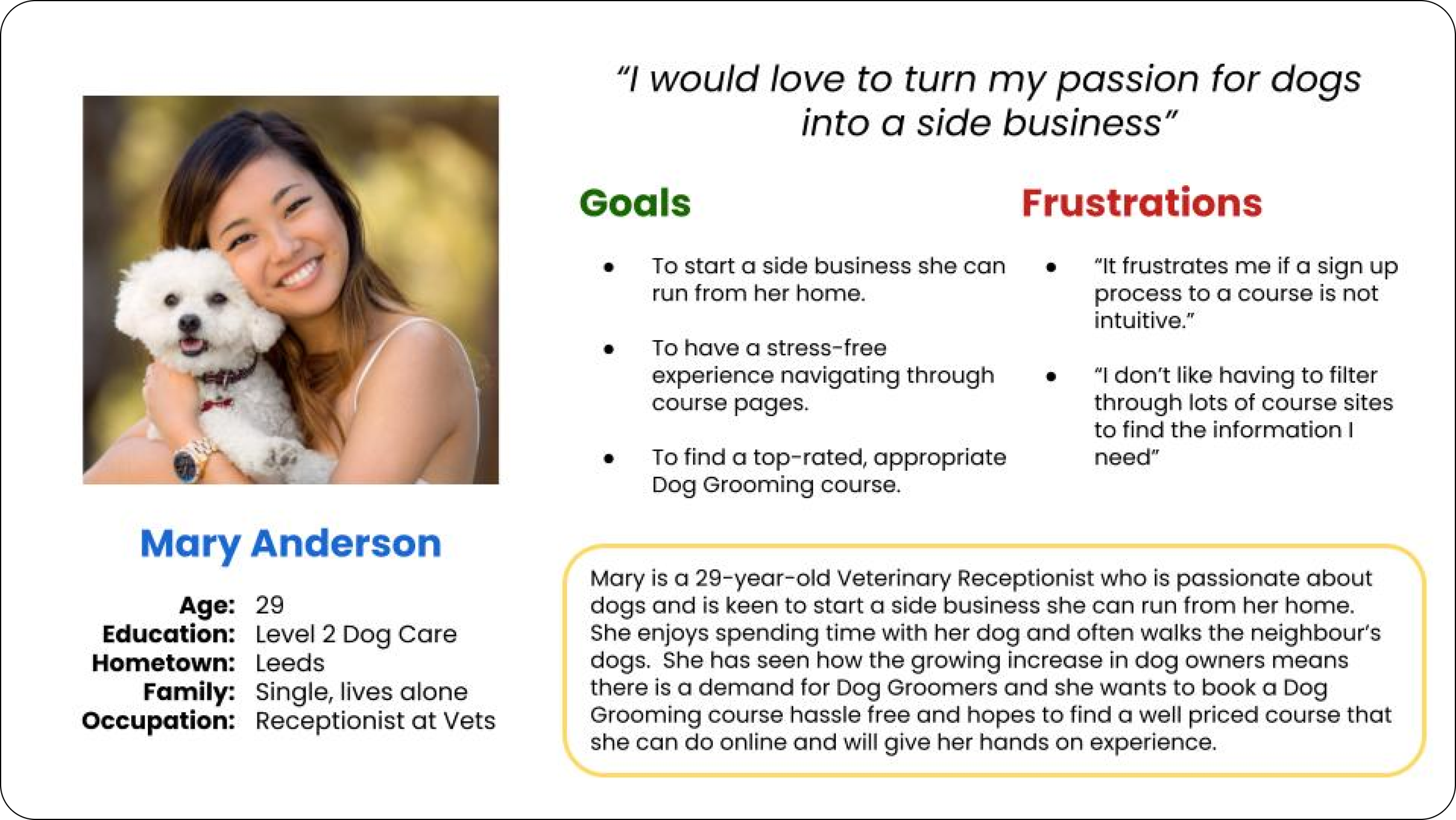
“I discovered research findings that showed that ‘the majority of Dog Groomers are women aged 20-30 years’”
I researched into what users use LearnDirect but the spectrum seemed very broad so I looked into statistics about Dog Groomers since this course page is advertising a course to gain a qualification in Dog Grooming.
I discovered that the majority of Dog Groomers are women and that a higher percentage of Dog Groomers are aged 20-30 years. Also since the number of dogs has increased in the UK by 10.2 million since 2021 this also represents a increased demand for Dog Groomers.
Therefore it is important to make the LearnDirect page clear and straightforward to understand in order to increase their sales and attract prospective students looking to learn how to become a Dog Groomer.

From this information, I created the persona of Mary (a 29 year old Veterinary Receptionist who is passionate about dogs and is interested in starting a side business as a Dog Groomer.)
Competitive Research
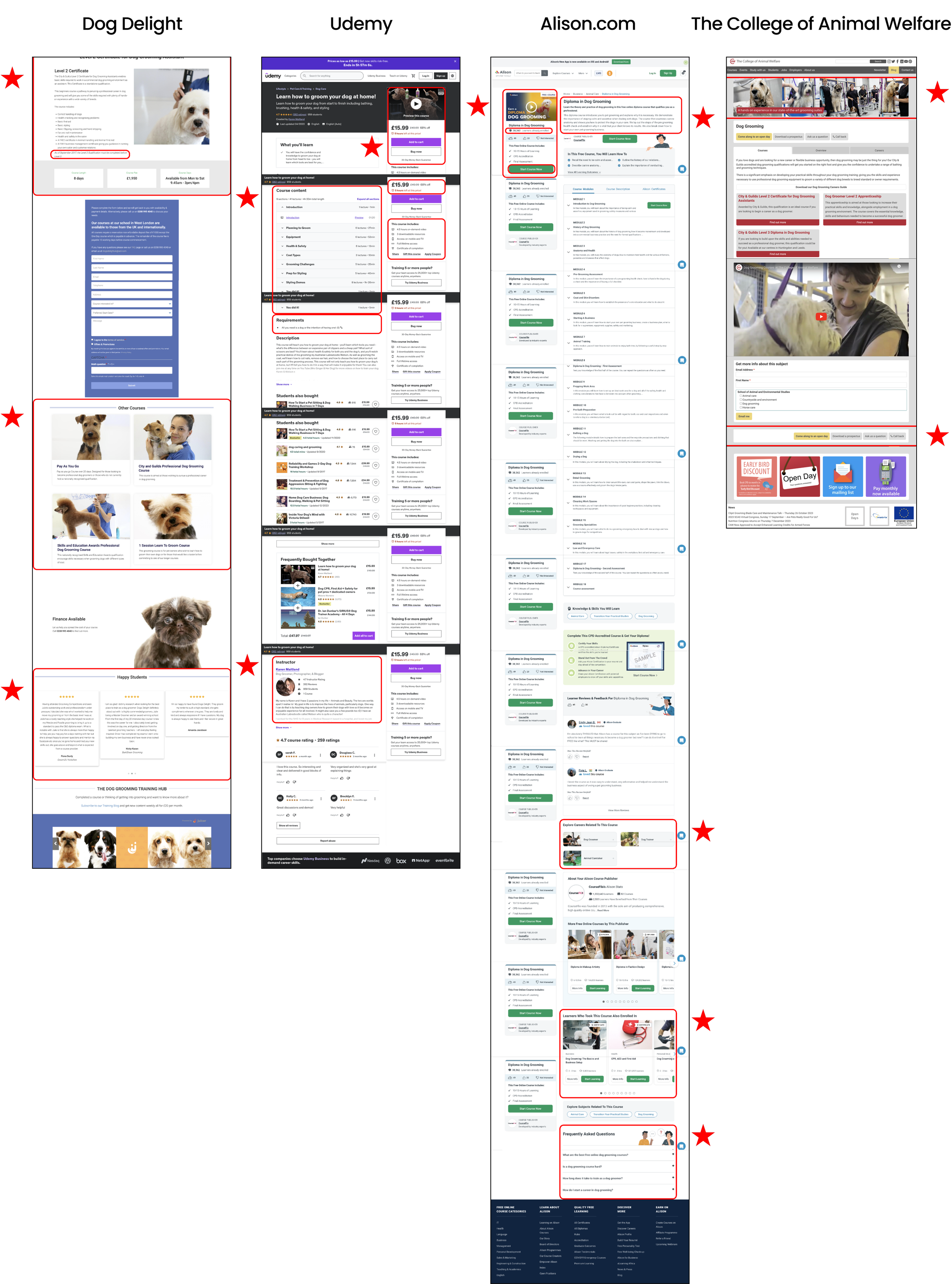
“I analysed 4 competitors to understand their strengths and weaknesses and discovered what gaps I could address and fix on the LearnDirect course page.”
I researched other websites offering Dog Grooming courses and came across the websites below. Some are direct competitors offering practical sessions and some are indirect competitors only offering online video classes.
I looked through these competitors’ sites and highlighted features that were clear, filled any gaps the users were missing on LearnDirect and demonstrated good UI.
Inspiration/ Layout prep
“Using the competitors’ websites as inspiration I took the elements that I liked and started to put together a template of how I wanted the screen to look”

Wireframes
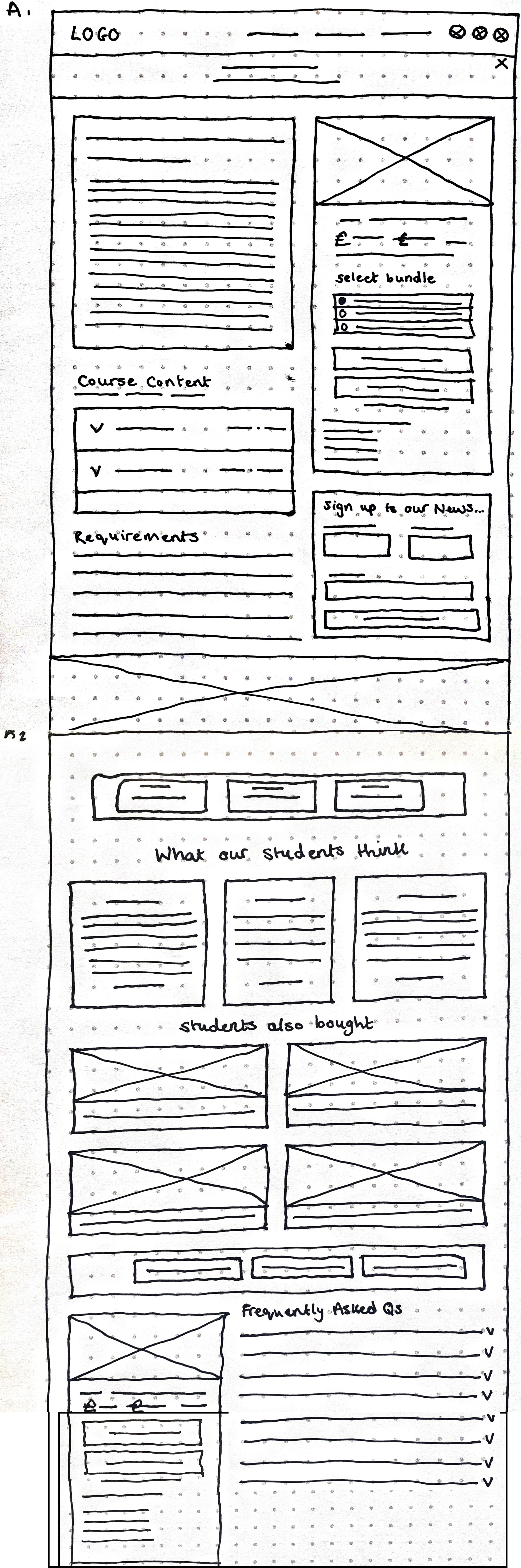
“I created wireframes to quickly get my ideas on paper, iterate and decide which features and functions were most important”
I created wireframes to get my ideas on paper and iterate quickly and see what works before moving onto low-fi screens.
Below you can see two variations, one that was a shorter more condensed page and one that included more features.
Using the user research and competitive research I decided it was important to have the frequently asked questions feature to answer and queries users might have regarding the course.
Also placing the ‘other course options’ below the user reviews made more sense when navigating the page.

Lo-fi Screens
“I created a low-fi screen from my wireframes and inspiration board to allow me to make sense of the layout and how I could use the information from the LearnDirect page’
Moving forwards I developed the paper wireframe A into a low-fi screen.

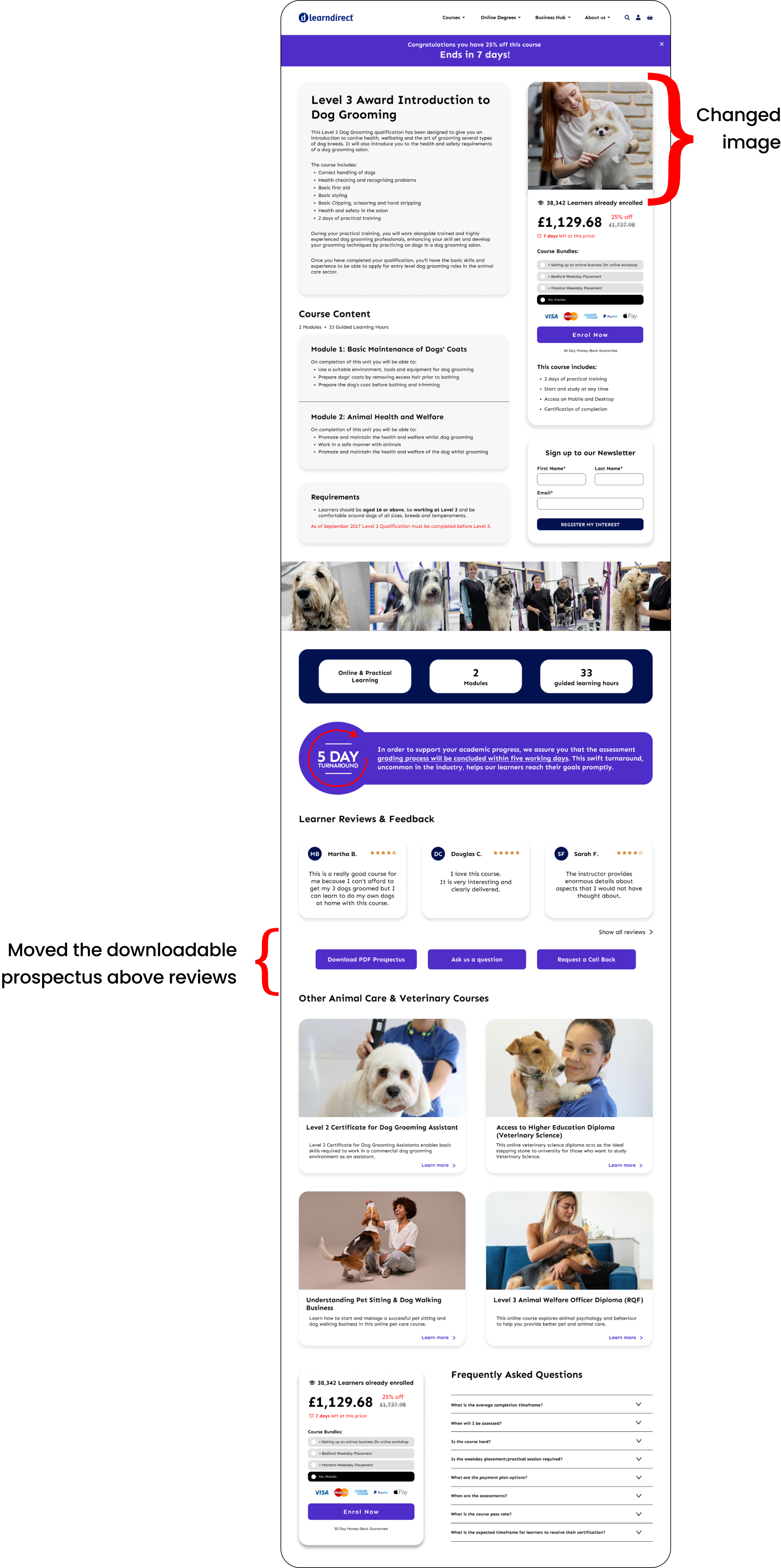
Hi-fi Screen
“I developed a hi-fi design using the low-fi screen as a guide backed by my research findings. This resulted in the creation of a detailed screen.”
I created this hi-fi screen using my low-fi screens as a guide.


Usability Test 2
‘I conducted another usability test with 5 users to discover which of my design versions they preferred and learn about any pain points they had.’
I conducted a second unmoderated usability test to find out what the users thought of the 2 versions of the course screens I had designed. I was looking to gain insights into how they navigate the screens and learn of any pain points of features that would need iterating.
I conducted the testing with 5 users (demonstrated by the different colours). The users were between the ages 11-66 years old. I asked them to voice record their thoughts and process whilst they navigated the screens, answering questions I had provided them with.
Below are my findings:

Main findings

Iterations
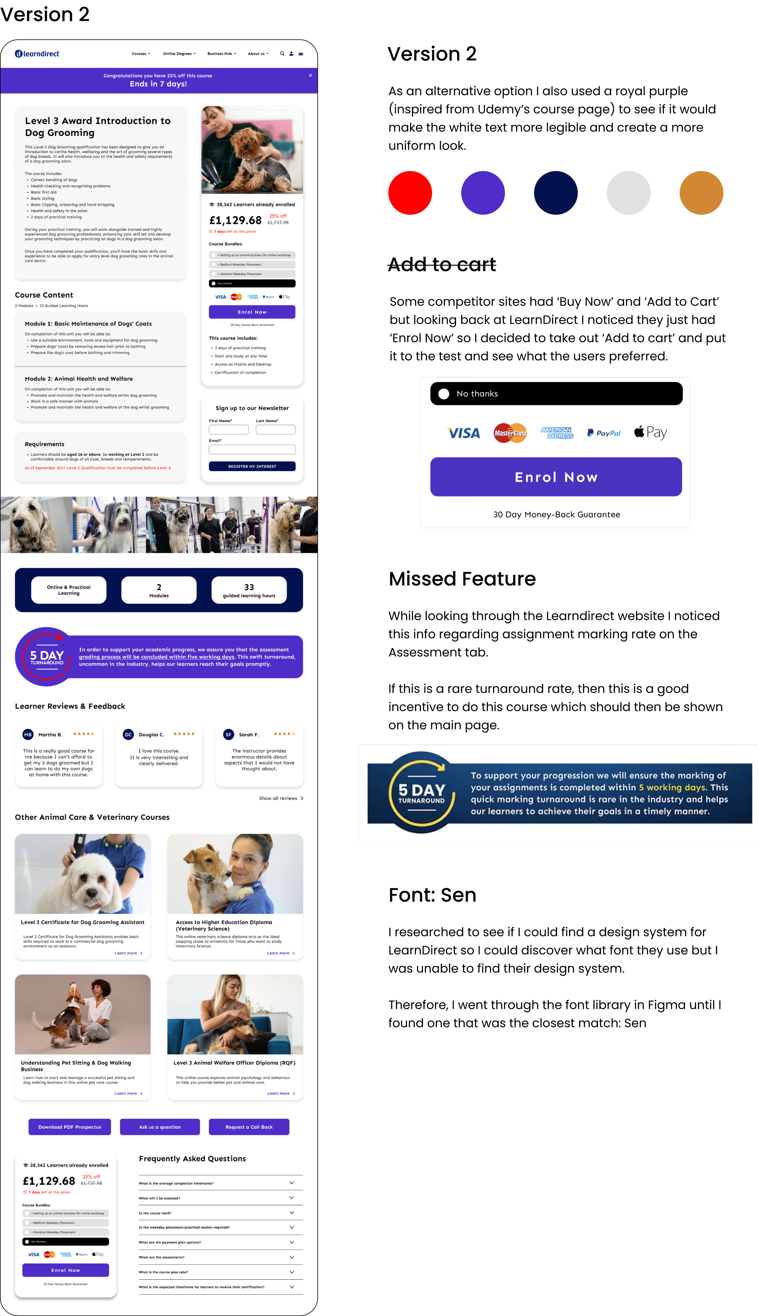
Version 2 was the preferred screen.
Accessibility considerations

Learnings
“Not being limited to a design style can be overwhelming but I found that I can always find the answers in research and user testing.”
I was excited to conduct this design test and I am pleased the project was able to achieve the goal of re-designing a pixel perfect high-fidelity screen for the LearnDirect course page and demonstrate my UX/UI skills.
With the brief stating ‘You should not be limited to the style and design of the current learndirect brand’ there were so many options as to how I could design the course page.
This can be overwhelming but I find that the answers always lie in research and user testing. I decided to first get user feedback on the current learndirect course page to discover their pain points.
The feedback discovered from the usability testing was very useful to understand what elements users liked, disliked and thought was missing. I moved forwards by conducting competitive research and matching what the users wanted with what I found competitors to be doing right.
I learnt a lot during this process and enjoyed demonstrating my UI skills ensuring the high fidelity screen was pixel perfect.
The main challenge was ensuring the layout was intuitive and the features were placed where users would find them most useful.
The next steps will include testing the prototype on more users to gather feedback and iterating the designs further.
