H&M Sign-up App Case Study
Wireframing & Usability Testing for H&M Membership sign-up app

Project Overview
Goal
Re-design the in-store sign up app that enables customers to become a H&M member so it is easier and quicker to navigate, therefore improving queue waiting times and customer satisfaction.
Obstacles
The sign up page for HM membership is confusing and customers have a hard time figuring out how to input their details like the calendar to select their date of birth. This slows down the process of getting the 10% discount incentive.
Skills & Methods Applied:
Design Skills
Wireframes
Prototypes
UX Flow
Low Fidelity Screens
High Fidelity Screens
Research Skills
User Research from findings online
User Journey Map
Usability Test
Soft Skills
Analysed research findings
Synthesised findings into insights.
Listened and empathised with user feedback from the usability tests
My Role
Junior UX Designer
Personal project
Timeline
October 2023
H&M “Membership sign-up app”
The goal of this UX study was to re-design the in-store sign up app that enables customers to become a H&M member so it is easier and quicker to navigate, therefore improving queue waiting times and customer satisfaction.


Original Sign-up app
H&M Staff members encourage customers to become members at the checkout, offering a 10% discount incentive on their first purchase.
The H&M in-store member’s sign up app allows customers to become H&M members which encourages them to spend more money and shop at H&M more regularly.
This in-store app is used by staff members to encourage customers to become a H&M member with an incentive of getting 10% off their first purchase. The target market for members is anyone 18+.


Understanding the user
“I developed a persona based on my research findings that ‘H&M mainly focuses on ages 15-30’ and ‘women are the important target group”
The primary user group for this research is H&M customers and the aim is to convert them to H&M members.
To have a better understanding of who a general H&M customer is and what their needs are I researched what age range H&M provides for and found a 2020 study that states ‘The brand offers fashionable clothes at reasonable prices, mainly focusing on middle-class people and college-going students at the age of 15 to 30 years.
The study also states that ‘College going students are a potential target group as they are willing to possess trendy fashion clothes and accessories at a minimal price.’
Also ‘Women are an important target group since the company also sells kids and men’s clothing, and it’s generally the women who shop for them.’
Using this research I created the persona of Alice (A 20 year old student who likes to buy the latest trends at an affordable price.)


User Journey Map
“I created a user journey map using my research and understanding of the existing product to show how the users would navigate the app.”
To demonstrate an understanding of how users would navigate signing up, I visualised the users process and used my knowledge of the existing product.
I then created this user journey map.
This helped me to move forwards and put the user first when designing paper wireframes.

Wireframes
“Based on the lowest point of the user journey, where the users are anxious to quickly enter their information, and my understanding that the calendar was a pain point, I created 4 wireframes of the calendar screen.”
Working on the tills, I have been able to observe the low and high points of the user journey, watching the customers navigating the sign-up flow.
The users struggle the most when they need to input their date of birth (which is required when signing up). 9/10 times the calendar confuses customers and requires staff assistance to explain how to navigate it.
Users also struggle to select the T&C’s button as it is very small and often requires them to tap it up to around 4 times.
Having a more intuitive and accessible sign up process would not only create a less frustrating and quicker experience for the customer signing up, it would also decrease customer waiting time in the queue therefore allowing us to serve more customers in a shorter space of time.
I created a user flow and calendar wireframes to get my ideas on paper and iterate quickly. I conducted research into calendar styles and used these findings to decide what features were important to incorporate. I drew 4 versions of the calendar to provide various options that I would then develop into low-fi screens before testing them on users.


Lo-fi Screens
“I created low fi screens to allow me to find out which calendar style users found more intuitive and easy to understand.’
I created low fi screens to have a basic layout of the app and use it for user testing to ensure all the navigation works smoothly and gather feedback before creating hi fi screens.
Below are the low fi calendar screens based on the paper wireframes I had drawn, I kept the design simple but included text when it would be relevant for the users in the usability test.
I was anxious to make the navigation easy and the calendar designs intuitive for the users before the usability test.
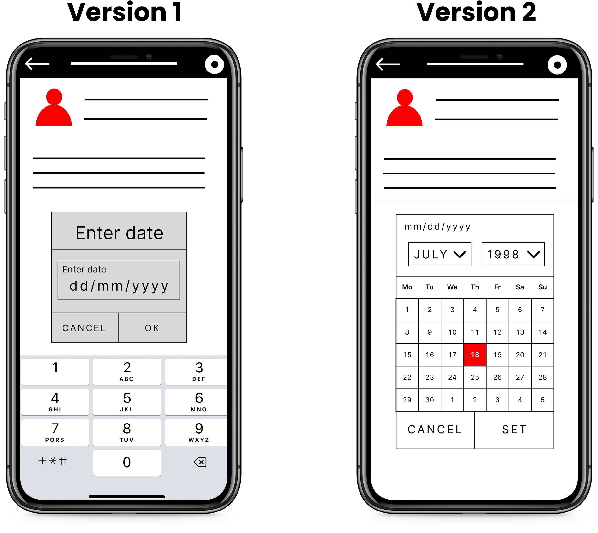

Version 1

Manual Typed Date entry
Version 2

Drop down boxes with mm/dd/yyyy
Version 3
Drop down boxes with prompt

Version 4
IOS Style Swipe date entry

Usability Test
‘I conducted a usability test with 5 users to discover which flow/calendar method they found the most intuitive.’
I conducted unmoderated usability testing to find out what users thought of the sign up flow and how they navigated through it.
This type of testing was the best choice for this project as it was low cost and allowed the users to work in the comfort of their normal environment.
I conducted the testing with 5 users. The users were between the ages 25-65 years old and I asked them to voice record their thoughts and process using the app as they followed the tasks I had provided them with.
I then compiled all the users comments and my observations into sticky notes.

Main Findings
‘I observed that users like the drop down boxes but don’t like to have to scroll back far and different nationalities can find the typed up calendar format confusing’
After I compiled all the users comments and my observations into sticky notes, I then used them to write out the main findings from the tests.
Version 1 the users generally found it straight forward and quick but they mentioned feeling unsure about whether it was an American or European date format and showed hesitation when typing in their date of birth.
Version 4 study found that younger users preferred this scrolling style whereas older users mentioned that it was frustrating having to scroll back far to their year of birth and they didn’t resonate as much with the title: ‘Pick a date.
When using Version 3, I observed that users seemed to understand the navigation better, completing the task without hesitation and complained less. This was better received than Version 2 due to the clear title and loss of the American calendar format.
The main findings from the tests were:
Users liked drop down boxes but they prefer not having to scroll back far
Different nationalities can find the different calendar date format confusing. eg. European vs. American date format
Older users wanted a quick way to select their year of birth.
Version 3 was the most popular choice as (3/5 users preferred this)
Version 3 was easier for users with poor eyesight/ disabilities.
At the end of the testing my observations gave me an understanding of what version to move forwards with and any iterations I needed to make to create a better user experience.
High-fidelity Screens
“I developed hi fi designs using the feedback from the users and observations in-store, this resulted in the creation of detailed screens with better accessibility”
Using my findings from the usability test, I created hi fi screens based on Version 3 but I iterated the features that did not create a good user experience.
This resulted in me developing detailed screens into a more realistic mock up, with smoother navigation and better accessibility.

I have observed how customers have often had to tap the terms and conditions box around three times for it to tick due to the small size of the box, I made the email and DOB box more accessible by making the boxes larger too.

The year and the month in the same drop down box confuses customers as they select the year then instinctively click the drop down box again to select the month which results in the calendar resetting to 2007.
9/10 times it not clear to the users that they need to choose the year from the drop down menu and then use the arrows to find the correct month.
After testing different versions of calendar designs I was able to discover what users found most intuitive.
My design makes it clear to the users how to change the month and the year and will help to create better customer satisfaction, quicker sign-up times and shorter queues in the shop.
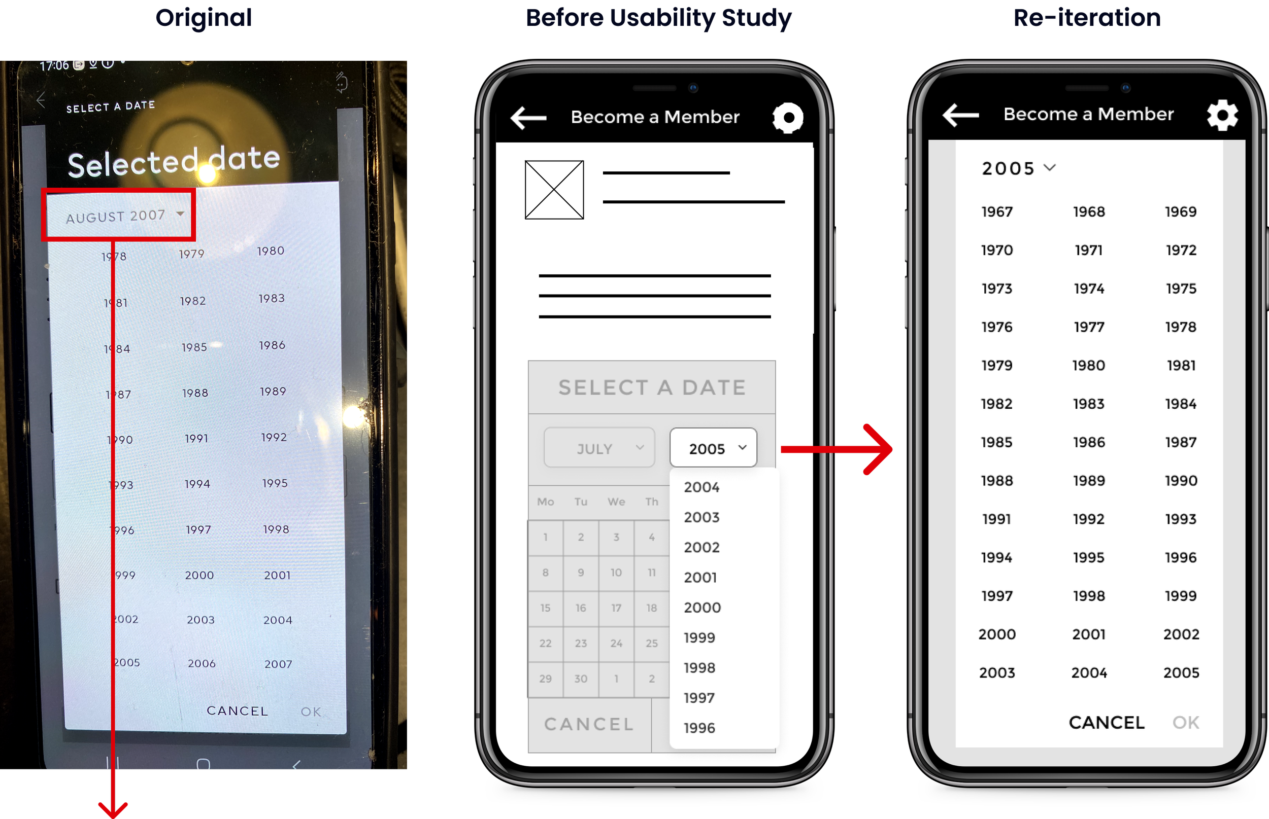
The problem with this design was that is confuses users into thinking it is the drop down menu for selecting the month too.
1.
Following the feedback from the users such as:
"I dislike the scrolling types as it takes me awhile to get down to 1959 and then pinpoint it"
I realised that this could frustrate a lot of users.
2.
This iteration created a compromise between the original and my design and would avoid confusing users into thinking it is the drop down box for selecting the month.
It would also requires less scrolling for older users to reach their year of birth.
3.

I updated the drop down month menu based on this user feedback:
"The month drop down box should open up to all 12 months so autumn babies don’t have to scroll."
I made sure all the months were visible to select so the new design doesn’t require the user to scroll even if they were born in autumn.
Key Screens
“I developed hi fi designs using the feedback from the users and this resulted in the creation of detailed screens with more accessible buttons.”

Prototype
“I used all the research and findings to create the prototype which resulted in a more user centred design.”
Using the findings I gained from my research and the user feedback, I created the prototype.
I ran through the prototype 5 times to ensure there was a smooth user experience and all the buttons worked.
I found it exciting and rewarding to create a prototype that would solve a real world problem that I had noticed in H&M.

User flow of sign-up
“I created a user centred sign-up process based on my research and feedback.”

Accessibility considerations
I provided larger buttons to make the sign-up process more accessible and quicker to navigate.
I used high contrasting colours and clear text prompts to help guide the user’s attention whilst ensuring the process is accessible for people with low vision, photosensitivity etc.
Learnings
“I learnt that making good observations is key because users behaviour and the way they interact with a product can say a lot.”
I was excited to conduct this project as I have seen first hand how the sign-up process can frustrate users. I am pleased the project was able to achieve the goal of re-designing the sign-up flow enabling users to have a more user friendly experience.
The feedback discovered from the usability testing was very useful to understand what elements users like in a calendar and what they found confusing.
I learnt a lot during this process such as how important it is to consider different ways data is formatted for different nationalities eg. European vs. American date format and I learnt that making good observations is key because users behaviour and the way they interact with a product can say a lot.
The main challenge was creating, iterating and testing the most intuitive way for users to complete an the sign-up process quickly, keeping in mind that this did not necessarily mean the flow with less clicks was the users favourite option.
The next steps will include testing the prototype on more users to gather feedback and iterating the designs further.
