Competitive Research & Prototyping for a Movie Metadata Catalogue
Design Task

Project Overview
Goal
The goal of this UX study was to design a high-fidelity mobile/desktop/tablet movie screen that allows users to read reviews, critic ratings, and user-generated opinions, with the aim of creating a satisfactory experience and promote engagement with the movie metadata catalogue.
Problem
Movie review enthusiasts want a quick way to gather information about a movie in order to decide whether to watch it without having to sift through lots of review sites.
Parents looking for suitable movies to watch with their kids have to switch between child-centred review sites and websites with movie critic reviews to decide if it will be enjoyable for all the family.
Skills & Methods Applied:
Design Skills
Wireframes
Prototypes
UX Flow
Low Fidelity Screens
High Fidelity Screens
Research Skills
User Research from findings online
Competitive Research
5 Usability Tests
Soft Skills
Analysed research findings
Synthesised findings into insights.
Listened and empathised with user feedback from the usability tests
My Role
Junior UX Designer
Design Task
Timeline
January 2024 (1 week)
High-fidelity screen for Paddington
The goal of this UX study was to design a high-fidelity mobile/desktop/tablet movie screen that allows users to read reviews, critic ratings, and user-generated opinions, with the aim of creating a satisfactory experience and promote engagement with the movie metadata catalogue.


Competitive Research
“I analysed 4 competitors to understand their strengths and weaknesses and discovered what gaps I could address.”
I came across the website: ‘Common sense media’ and was interested that they provide movie reviews for Parents, to help them decide if a movie is appropriate for their child to watch.
This isn’t provided on websites like Rotten Tomatoes or IMBD and I thought it would be useful for a movie review enthusiast to be able to check out the general reviews for movies they are interested in and also check parent reviews for their children, without having to switch sites.

I looked through these competitors sites and then highlighted the features I liked and wanted to implement in my design.

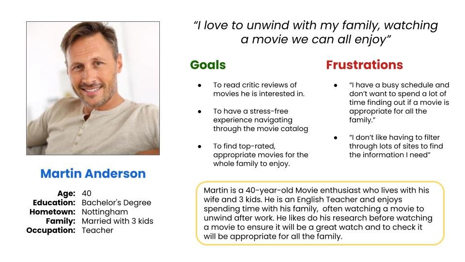
Persona 1
“I chose persona 1 based on the discovery of a gap in the market ‘A movie review site that is useful for the whole family’”
From the Persona options provided I chose to focus on Persona 1. I came to this decision after doing some research into movie website competitor’s and looking for any gaps in the market.
With my decision in place I created the persona of Martin (A 40 year old movie enthusiast and parent who likes to read up on movie reviews and ratings before deciding to watch a movie with his family.)
Mobile First
“I started researching and designing for the mobile screen first due to the findings that ‘the mobile traffic market share is the largest in December 2023 with 71.32% of all Mobile traffic in United Kingdom’”
I decided to research mobile sites and work on the mobile screen first as this is likely be used more than the desktop or tablet. This is backed by the findings that in the United Kingdom the mobile traffic market share is the largest in December 2023 with 71.32% of all Mobile traffic in United Kingdom.
Therefore I believe the mobile screen should guide the design layout before I move onto designing a responsive desktop and tablet screen.

Inspiration/ Layout prep
“Using the competitor’s websites as Inspiration I took the elements that I liked from them and started to put together a template of how I wanted the screen to look”

User Journey Map
“I created a user journey map using my competitive research and understanding of the users to show how the users would navigate the screen.”
I wanted my Movie screen to be relevant to all users whether they have children or not so I decided to have a general movie review page with critic and user reviews and then a Parents’ Guide that would be linked to the main page.
To demonstrate an understanding of how users would navigate the screen, I visualised the users process and used my knowledge of the existing movie websites on the market.
I then created this user flow, utilising my research.
This helped me to move forwards and put the user first when designing paper wireframes.

Wireframes
“I created wireframes to quickly get my ideas on paper, iterate and decide which features and functions were most important”
I created wireframes to get my ideas on paper and iterate quickly and see what works before moving onto low fi screens.
At first I was overwhelmed with the various layout options for the main movie screen but I moved forward by deciding that I would put the different versions to the test by creating 3 low-fi main screen options from the paper wireframes to test on the users.
This put my mind at ease as I knew by testing it on the users I would find out which layout they liked best and what features and functions are most important to them.
Here are the Paper wireframes:

Lo-fi Screens
“I created low-fi screens to allow me to find out which layout users found more intuitive and gather feedback.’
Moving forwards I developed the paper wireframes into low-fi screens, ready for user testing.
I was anxious to make the navigation easy and the layout intuitive for the users before starting the test.

Usability Test
‘I conducted a usability test with 5 users to discover which version they found more intuitive and learn more about what was important to them.’
I conducted unmoderated usability testing to find out what they thought of the 3 versions of the Main Screen and the Parents’ Guide; gain insights into how they navigate the screens and learn what features are important to them.
This type of testing was the best choice for this project as it was low cost and allowed the users to work in the comfort of their normal environment.
I conducted the testing with 5 users. The users were between the ages 36-65 years old and all have a children. I asked them to voice record their thoughts and process whilst they navigated the screens, answering questions I had provided them with.
I then compiled all the users comments and my observations into sticky notes.
I gave the users a set of questions to answer whilst going through the low fi screen options, there answers then gave me great insight into what they liked, disliked and anything they didn’t understand.
Overall the users generally found the layouts straight forward and easy to navigate but they gave me valuable feedback about ways they thought the layout could be improved.
The main findings from the tests were:
Users liked the video trailer layout in Version B
3/5 liked the Parents’ Guide link in the centre of the main screen
Users liked the Audience and Critic score at the top of the main screen
Version B was the most popular choice as (4/5 users preferred this)
Parents want to read the content details more than the Parents/Kids reviews
Lo-fi Screen Iterations
“Using the user feedback I made iterations to the low-fi screen in order to have a clear understanding of what the user-centred layout should look like before I moved on to the hi-fi screens.”

High-fidelity Screens
“I developed hi-fi designs using the feedback from the users and using the iterated low-fi screen as a guide. This resulted in the creation of detailed screens with a user-centred design.”
I created these hi-fi screens using my iterated low-fi screens as a guide.
This resulted in me creating detailed screens with a smoother layout and better UI by utilising the findings from the usability test.
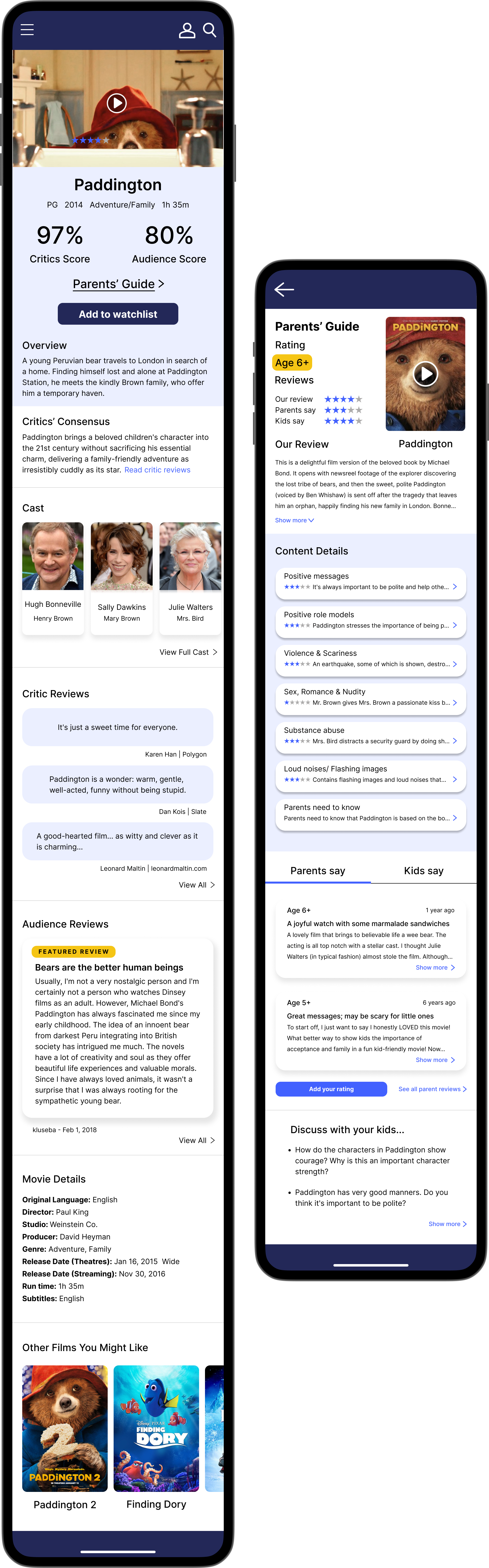
I chose the movie: Paddington because having watched it with my family at Christmas I thought it was a good example of a film that has a wide audience, has a positive message and family feel to it.
Although, regardless of my movie choice, these screens could cater for any movie/tv show.
User Flow

Competitive Research
“I looked at the competitors’ desktop websites before moving on to designing my desktop screen, this helped me to gain an understanding of how to create an effective layout that would be intuitive for users.”

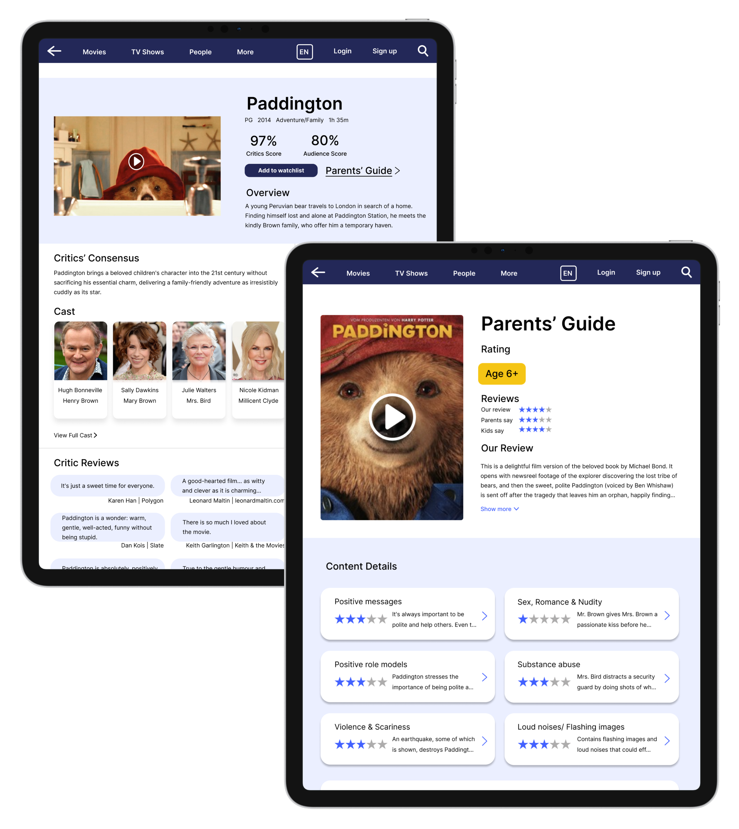
Desktop Screen
“I made use of the larger space by increasing the amount of items per section and I had noticed that competitors’ sites utilised 2 columns so I followed this layout so the page flowed nicely and required less scrolling ”


Tablet Screen
“I used the desktop screen as a guide when moving on to creating the tablet screen, since these screens are not too drastically different in shape compared to the mobile screen.”
Accessibility considerations
Used high contrast colours to help guide the user’s attention whilst ensuring it is accessible for people with low vision, photosensitivity etc.
Provided access for users who are vision impaired by adding Alt text to images and icons for screen readers
Included information that would allow users to determine if the movie was accessible for them to watch such as: Subtitles information, flashing images and loud noise warnings.
Learnings
“I learnt that if in doubt put the design to the test with the users as that is where the key information is.”
I was excited to conduct this design test and I am pleased the project was able to achieve the goal of designing a high-fi screen for a specific movie and fill a gap in the market.
With so many options as to how a design can look I decided to get the users feedback on a variation of low-fi screens rather than getting their feedback on only one low-fi screen. The feedback discovered from the usability testing was very useful to understand what elements users liked in the wireframes and this helped to guide the following designs.
I learnt a lot during this process such as how I can utilise Auto layout to my benefit and I came to have a better understanding of movie website layouts.
The main challenge was creating a screen that would cater for everyone, whether it is a person looking for critic reviews or a parent looking to find out if a movie is suitable for their child to watch.
In the end I decided it was best to create 2 screens to achieve this so it would appeal to the movie review enthusiast and also parents/kids.
The next steps will include testing the prototype on more users to gather feedback and iterating the designs further.