Snackflicks App Case Study
Prototyping & Usability Testing for cinema food seat delivery app

Project Overview
Goal
The goal of this UX study was to design a mobile movie snack ordering app that allows users to order food to pickup before their movie begins, with the aim of creating a satisfactory experience and promote engagement with the app.
Obstacles
It was difficult to refine which features to include in the app in order to make it have a clear function and ensure navigation was strong
Skills & Methods Applied:
Design Skills
Wireframes
2 Prototypes
UX Flow
Low Fidelity Screens
High Fidelity Screens
Research Skills
User Research from findings online
Competitive Audit
2 x(5 Usability Tests)
Soft Skills
Analysed research findings
Synthesised findings into insights.
Listened and empathised with user feedback from the usability tests
My Role
Junior UX Designer (My personal project)
Timeline
July 2023 - October 2023
Snackflicks “Movie snacks app”
The goal of this UX study was to design a mobile movie snack ordering app that allows users to order food to pickup before their movie begins, with the aim of creating a satisfactory experience and promote engagement with the app.

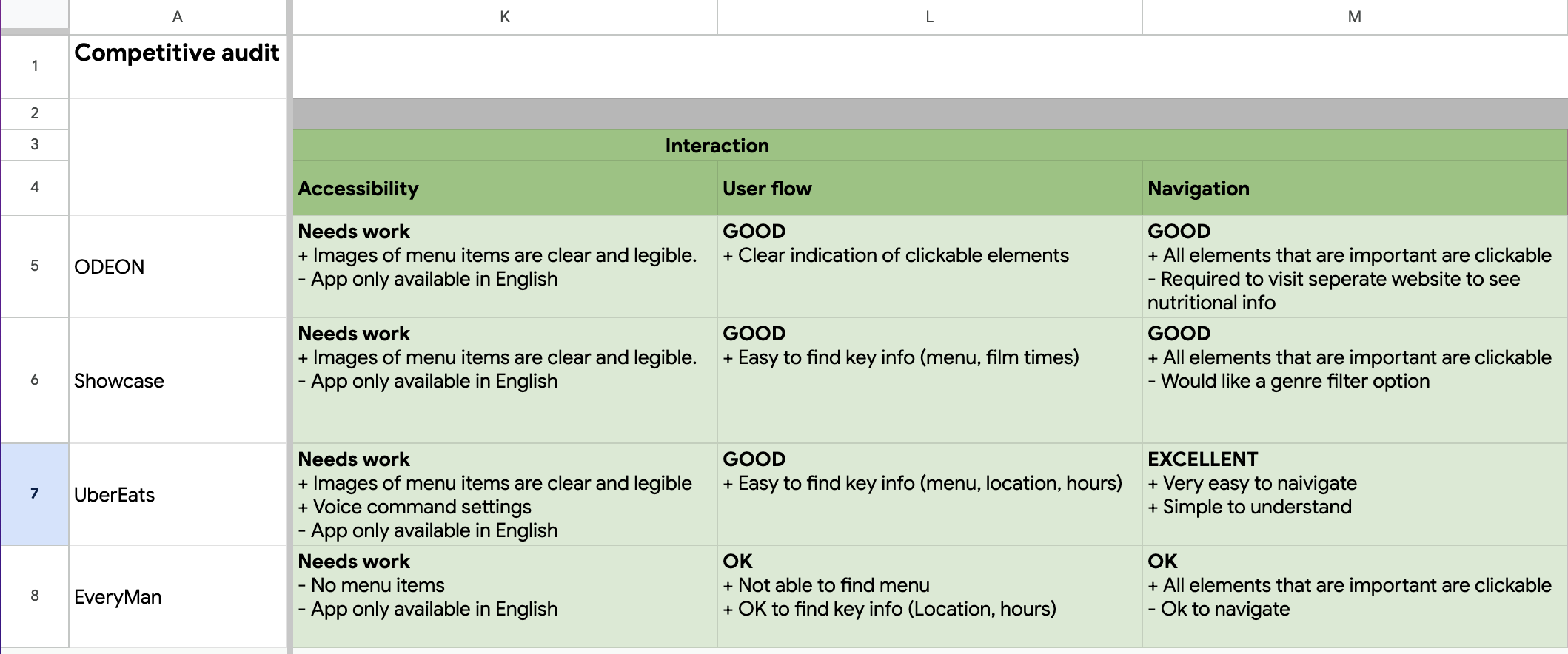
Started with Competitive Research
“I analysed 4 competitors to understand their weaknesses and discovered what gaps I could address in my app.”
I started with competitive research because I wanted to analyse competitors to find out any of their weaknesses and any gaps that I could address in my app.
I searched for direct and indirect competitors and then began to compare the in-app ordering experience of each competitor, looking at the unique value proposition, features, accessibility, user flow, navigation, brand identity and content of each app.
The results were very interesting as I noticed features that were lacking in the apps.
Some gaps that I identified included:
All the apps are only available in English
The cinema apps require you to purchase a ticket to view/order food
Locator feature is missing from ODEON and Showcase
Only UberEats has dietary information on the menu
There is no menu available on EveryMan

With the current results I wanted to learn more about the users and target market. I wanted to gain new insights of the best way to utilise these gaps whilst designing with the users in mind.
Competitive Audit


Understanding the user
“I developed a persona based on my research findings that ‘38% of cinema’s returning audience are 16-34’ and this helped me to understand the user.”
To have a better understanding of who a general user is and what their needs are I researched who are the most common cinema goes and a 2021 study found that ‘Based on the opening seven months, 38% of cinema’s returning audience are 16-34’ and a 2019 study showed that ‘71% of adults agree that “A trip to the cinema lets them escape from everyday life”’
I created a persona based on this age range and reason why people go to the cinema.
Below is the persona of Alfie (A 28 year old working professional who likes to attend the movies to relax after a busy day at work)

User Journey Map
“I created a user journey map using my competitive research to understand how the users would navigate the app.”
To have an understanding of how the users would navigate through the app I visualised the users process and used my competitive research to understand what different ways a user can navigate an order in the competitors apps.
I then wrote the general navigation flow in a table, utilising my research.
This helped me to move forwards and put the user first when designing paper wireframes.


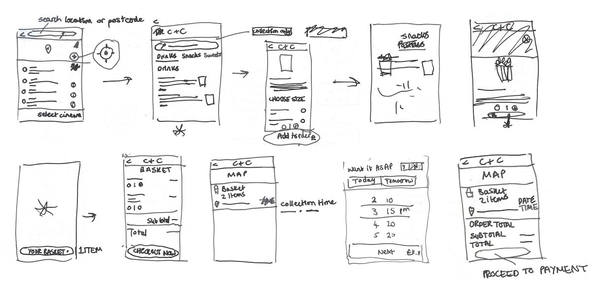
Wireframes
“I created wireframes to get my ideas on paper, iterate and decide which features and functions were most important. This gave me a clear guide before moving on to digital wire framing.”
I created wireframes to get my ideas on paper and iterate quickly and see what works before moving onto digital wireframes.
At first I was overwhelmed by the design features and processes I could include in the app but I moved forward by using the research findings from the competitive audit to decide what features and functions were important to incorporate.
I drew 5 versions of the home page and then starred the features which I felt were most important and then created a final homepage paper wireframe with this information.

I then proceeded to draw paper wireframes for the other screens:
Lo-fi Screens
“I created low fi screens to allow me to test the app navigation with users. The result was a functioning digital wireframe.”
I created low fi screens to see the basic layout of the app and use it for user testing to ensure all the navigation works smoothly before and gather feedback before creating hi fi screens.
I based the low fi screens on the paper wireframes I had drawn, keeping the design simple but including text when it would be relevant for the users understanding in the usability test.
I was anxious to make the navigation easy for the users before the first usability test and tried to ensure all the relevant buttons worked.

Usability test 1
“I conducted 5 usability tests to get feedback from users and found that users wanted better navigation options (the back button didn’t work) and more accessible buttons.”
I conducted unmoderated usability testing to find out what users thought of the app and how they navigated through it.
This type of testing was the best choice for this project as it was low cost, allowed the users to work in the comfort of their normal environment.
I conducted the testing with 5 users. The users were between the ages 26-64 years old and I asked them to voice record their thoughts and process using the app as they followed the tasks I had provided them with.
I then compiled all the users comments and my observations into sticky notes which I grouped into categories.
I wrote down the main findings from the tests, which showed that:
Users wanted a cinema context for the homepage
Users wanted better navigation options eg. the back button didn’t work
Users wanted better accessibility eg. buttons lower down for thumbs
This gave me an understanding of what iterations I needed to make to create a better user experience.
High-fidelity Screens
“I developed hi fi designs using the feedback from the users and this resulted in the creation of detailed screens with smoother navigation and better UI.”
I created hi fi screens using my findings from the usability test so that in the next round of testing users would have a more realistic mock up to use and therefore I would get a better understanding of how they would use the real app.
Using the findings from the usability test I created hi fi screens based on the low fi screens but I iterated the features that did not create a good user experience.
This resulted in me creating detailed screens with smoother navigation and better UI by utilising the findings from the usability test 1.

Increased cinema context by showing movies at the top of the page
Moved the click and collect feature lower so it was more accessible for the thumbs.
I also fixed the issue with the back buttons not working.
This is the flow for navigating the menu

Usability test 2
“I conducted another 5 usability tests to get feedback and found that users wanted better wording for buttons and the ability to see how many items were in the basket.”
I conducted another unmoderated usability test to find out what users thought of the improved hi fi screens and discover any issues the users were still facing.
I utilised the same method and same 5 users as usability test 1.
I compiled all the users comments and my observations into sticky notes which I grouped into categories before writing out the key findings from the tests.
The key findings were that:
Users wanted better wording for buttons such as Manual and Click & Collect
Users thought the header was boring and wanted something brighter and more attractive
Users wanted the ability to see how many items were in their basket when back on the homepage.
Users wanted the option to have food delivered to their seats

I updated some wording in the app based on feedback I had from the usability study:
One quote from peer feedback:
"The only thing was when I had the choice of Apple pay or Manual, I don't think I've seen it say manual in other apps before so that has thrown me"

Based on this feedback from the users:
“The header is quite boring and basic"
“The home screen doesn't look that exciting"
I made the header more interesting and brighter by using a gradient fill and I increased the movie context further by adding the symbols at the top to show what the options are in the app.
I also changed the click and collect wording as I had now added the delivery option to the app.

I updated the app so that it was clear to users how many items were in their basket no matter what page they were on rather than having to go into the basket.

2 users mentioned that it would be good to have the option to have the food delivered to their seat in the cinema. This exciting insight gave me another way to add a feature that was a gap in the market.
I researched table ordering apps and took inspiration from the Brewdog restaurant mobile website. Having eaten there before I have found it easy to navigate the webpage and from the user feedback on my hi-fi designs it was clear that the users would like the option to stay in their seat too.
Prototype
“I used all the research and findings to create the prototype which resulted in a more user centred design.”
Using all the research and findings from the project I proceeded to create the prototype which would allow the app to work as it would on a phone.
I took the findings from the usability test 2 to reiterate the hi fi designs and then add any animations that were necessary for the design.
I found it exciting and rewarding to create a prototype by utilising the findings I gained from research and testing. I felt more confident with the iterations having done the usability tests and I ran through the prototype 5 times to ensure all the buttons and animations worked smoothly.

User flow of checkout - collection

User flow of checkout - delivery

Accessibility Considerations
Provided access to users who are vision impaired through adding alt text to images and icons for screen readers.
Provided larger buttons and low button placement to make the the app easier to navigate and more accessible for the thumbs.
Used high contrasting colours to help to guide the user’s attention whilst ensuring the process is accessible for people with low vision, photosensitivity etc.
Learnings
“Even if you have a goal to achieve one thing, it is important to stay open to answering other problems which might be even more beneficial to the users.”
I have thoroughly enjoyed this project and I am pleased the project was able to achieve the goal of designing an app that enables users to place an order ahead and pick it up before their movie begins.
I am particularly pleased that I discovered from the usability tests that users also wanted the ability to order food to their seat.
I learnt a lot during this process such as how important it is to ensure all navigation buttons work before conducting the usability tests and that even if you have a goal to achieve one thing, it is important to stay open to answering other problems which might be even more beneficial to the users.
The main challenge was creating, iterating and testing the most intuitive way for users to complete an order quickly and allowing users to see how many items were in their basket throughout the app.
The next steps will include testing the prototype on more users to gather feedback and iterating the designs further.